Barclays Phonebook
Improving the design of one of the most used applications at the bank.
The project
The Barclays phonebook is an internal colleague directory that was really in need of a refresh. The application allows colleagues to manage user profiles, search and find each other’s details and locate branch and office information in one convenient place. It is one of the most used applications at the bank, and an essential resource for connecting with colleagues. My role was to lead the UI design on this project and bring it on brand with the recently launched new Barclays brand style. I also helped the team to Improve the UX and accessibility of the app and worked on concepts and final designs for diversity and inclusion features.
Deliverables
CREATIVE DIRECTION
UI DESIGN
UI HANDOVER SPECS
Project aims
Improve the overall UI of the app and bring it on brand
Improve diversity and inclusion
The existing Phonebook was impacted by really poor accessibility. The way it was built, the font-sizes used and the ux patterns all made for a hard to use app for everyone at Barclays. Some of the content on the app was so old current Barclays employees had no idea what some of it was or how to update it. The UI was seriously out of date and did ’t use the recently updated Barclays brand so needed a redesign to bring it up to modern day design standards.
Before starting any design work, I pushed for our team to use the new Barclays component library by promoting the benefits of using it for the project and the whole team. This company-wide design system was still in its early stages but using it meant we could design and build pages quickly, knowing that what we were using was accessible, on brand, and had features like dark mode already enabled. This led to our team being among the first to implement the new brand for an internal-facing project.
Once setup, I created every UI aspect of the new redesign from templates, forms, error scenarios to UI spec handovers and walkthroughs.
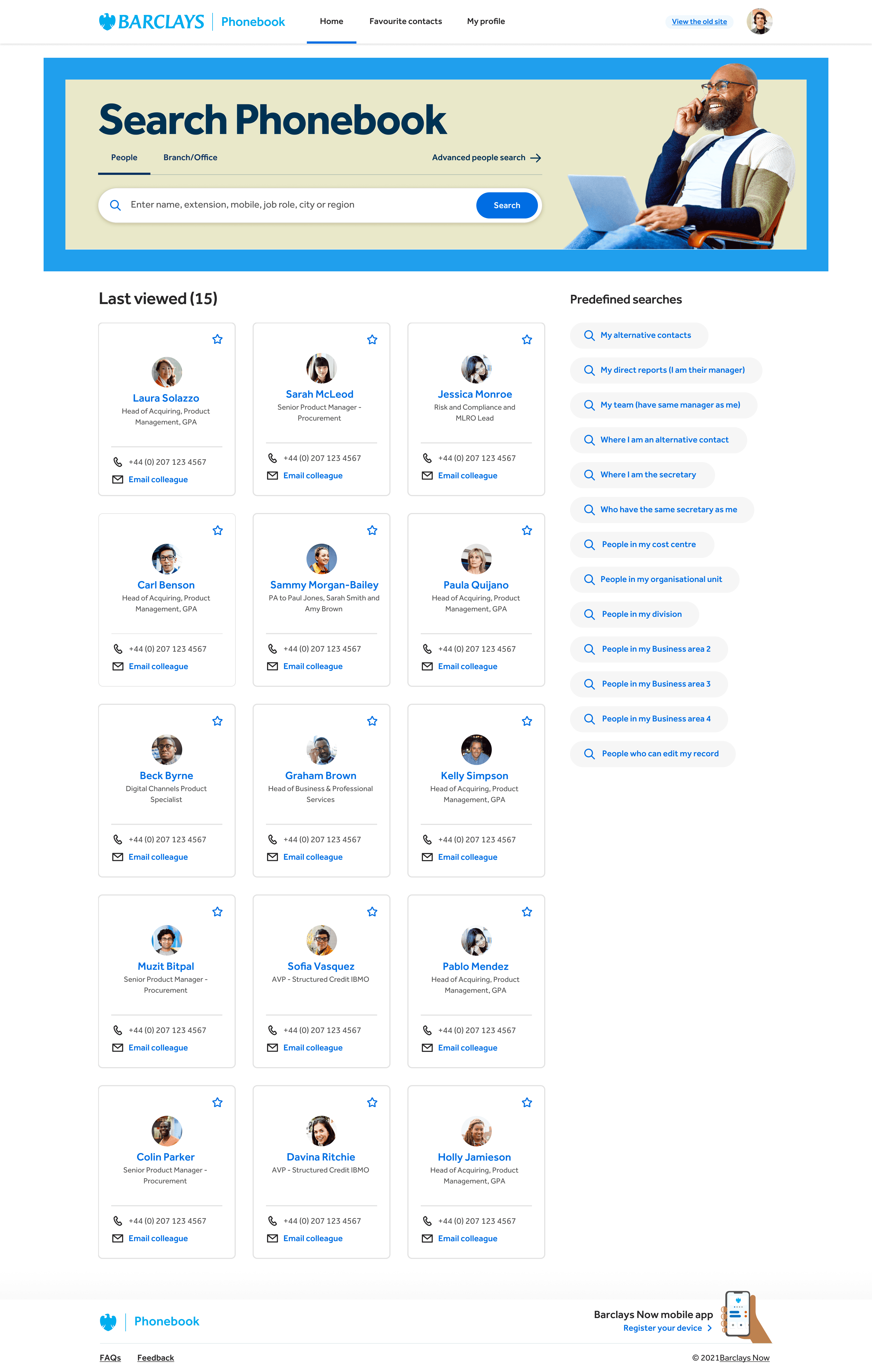
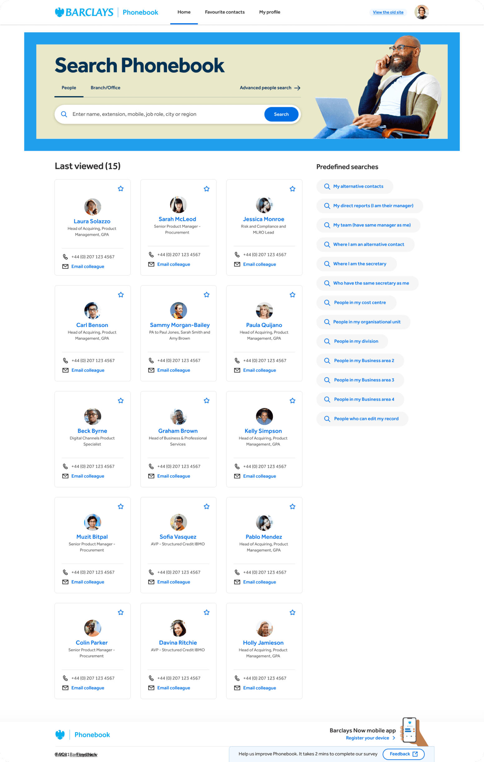
Giving Phonebook a homepage
The redesign process began with the homepage. The old version of the app lacked any introductory or landing content, dropping users into a blank page. I created a new homepage featuring a prominent visual element to highlight the search bar. Below that, we included previously viewed items.
Additionally, we added quick search options to the right as part of a user experience test. These options were previously hard to find on the old site, so we placed them on the homepage of the new site to gauge user interest. If users found them useful, we planned to incorporate them as recommended searches within the search bar interface.
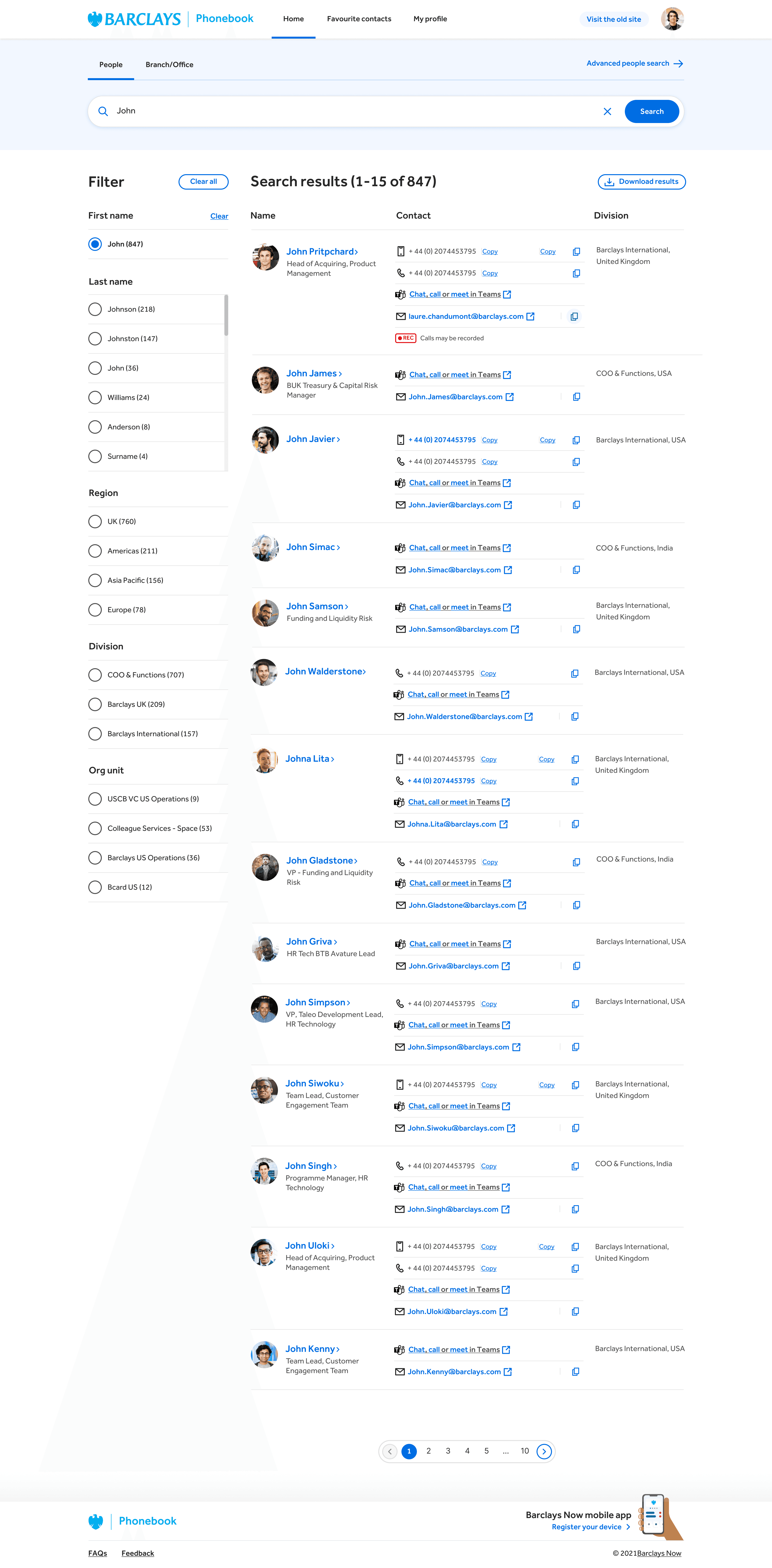
Search listing
The redesign process began with the homepage. The old version of the app lacked any introductory or landing content, dropping users into a blank page. I created a new homepage featuring a prominent visual element to highlight the search bar. Below that, we included previously viewed items.
Additionally, we added quick search options to the right as part of a user experience test. These options were previously hard to find on the old site, so we placed them on the homepage of the new site to gauge user interest. If users found them useful, we planned to incorporate them as recommended searches within the search bar interface.
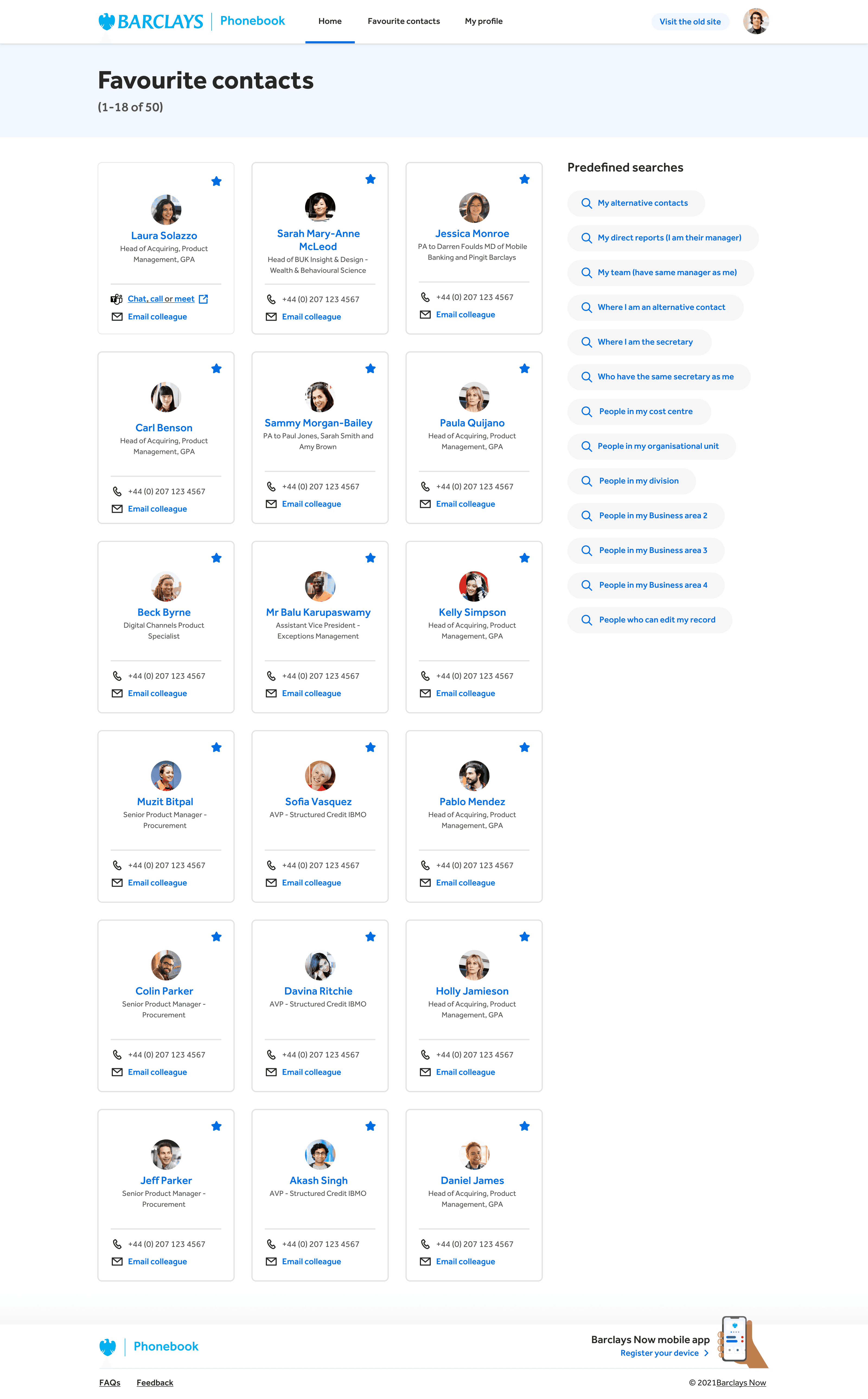
Favourites
The redesign process began with the homepage. The old version of the app lacked any introductory or landing content, dropping users into a blank page. I created a new homepage featuring a prominent visual element to highlight the search bar. Below that, we included previously viewed items.
Additionally, we added quick search options to the right as part of a user experience test. These options were previously hard to find on the old site, so we placed them on the homepage of the new site to gauge user interest. If users found them useful, we planned to incorporate them as recommended searches within the search bar interface.
Branch details
The redesign process began with the homepage. The old version of the app lacked any introductory or landing content, dropping users into a blank page. I created a new homepage featuring a prominent visual element to highlight the search bar. Below that, we included previously viewed items.
Additionally, we added quick search options to the right as part of a user experience test. These options were previously hard to find on the old site, so we placed them on the homepage of the new site to gauge user interest. If users found them useful, we planned to incorporate them as recommended searches within the search bar interface.
Colleague profiles
The redesign process began with the homepage. The old version of the app lacked any introductory or landing content, dropping users into a blank page. I created a new homepage featuring a prominent visual element to highlight the search bar. Below that, we included previously viewed items.
Additionally, we added quick search options to the right as part of a user experience test. These options were previously hard to find on the old site, so we placed them on the homepage of the new site to gauge user interest. If users found them useful, we planned to incorporate them as recommended searches within the search bar interface.
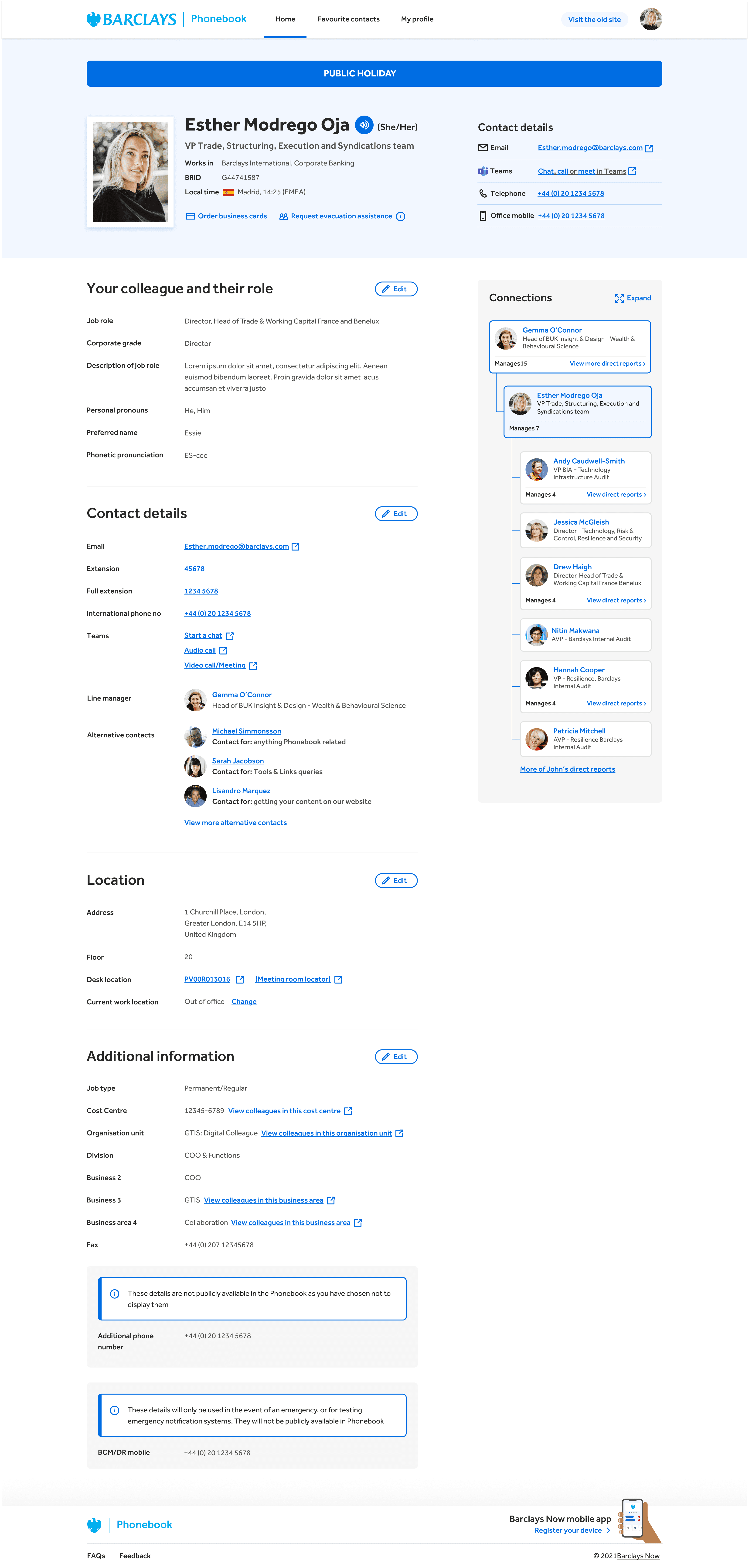
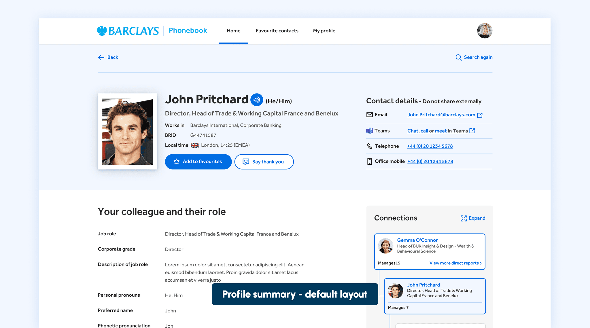
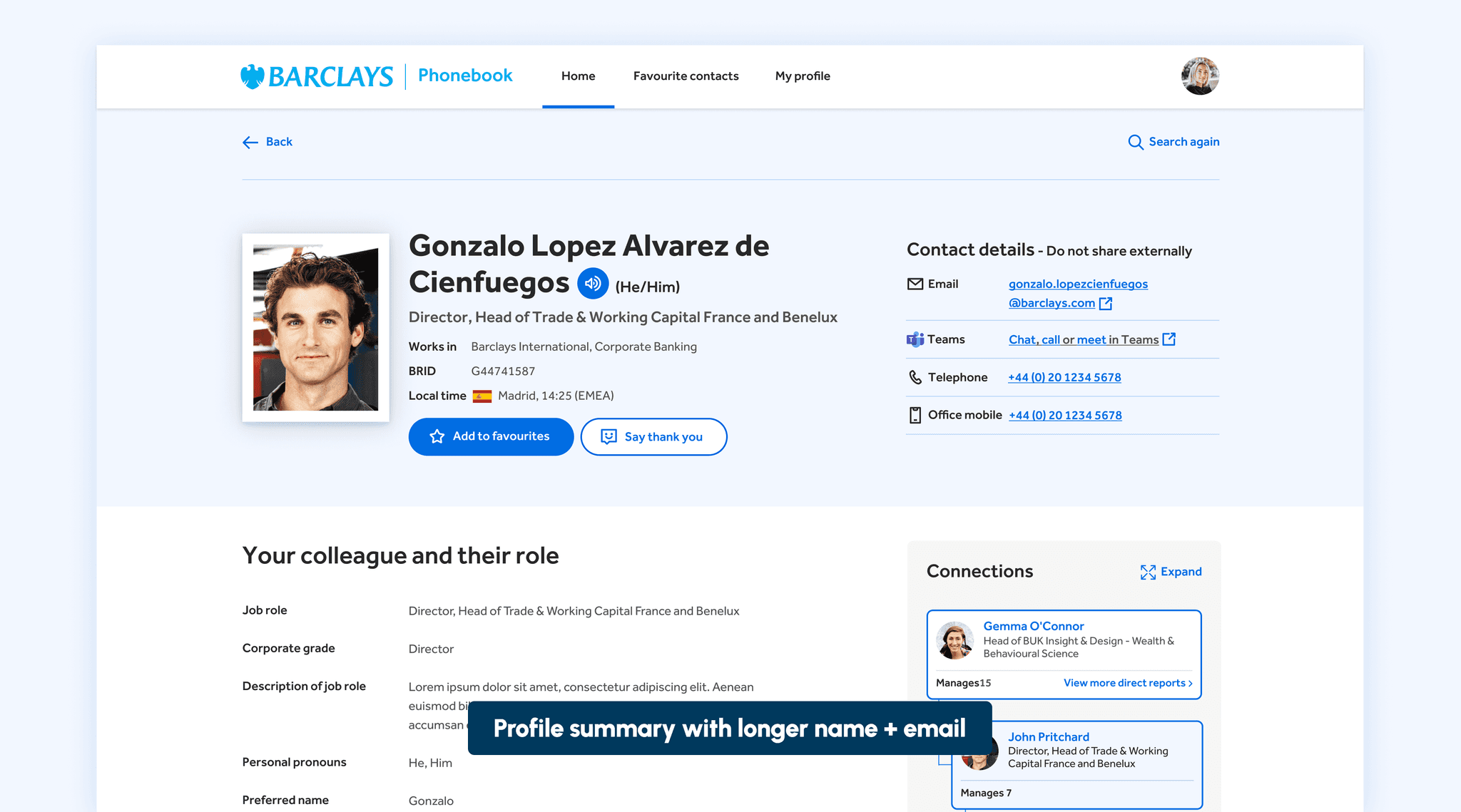
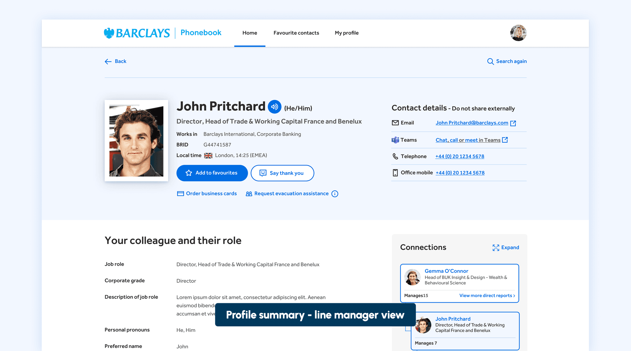
Prioritising content
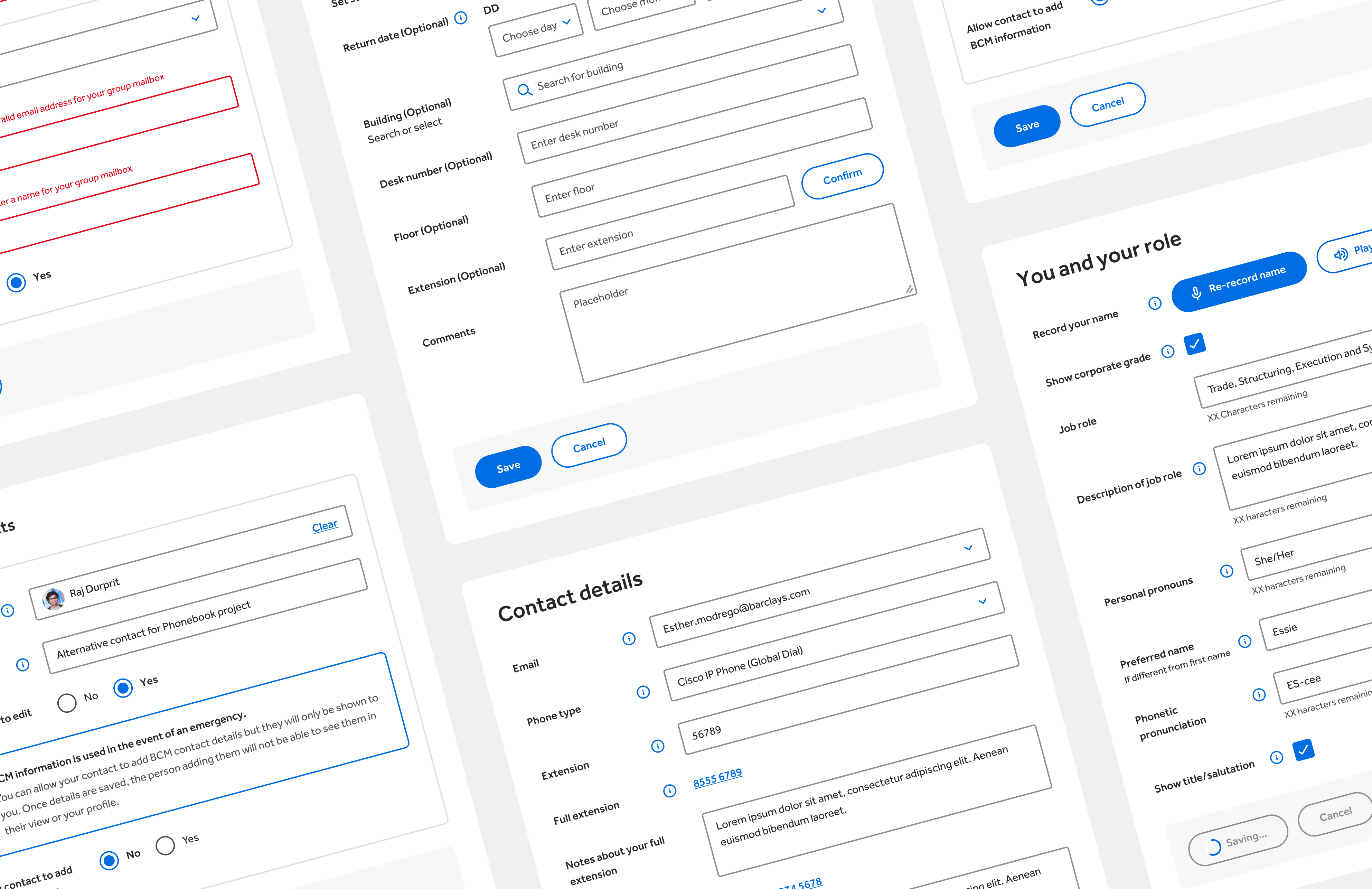
I designed the profile to have a summary area at the top that highlighted the details that colleagues looked for the most when visiting. The summary itself provided a bit of a UI challenge. Dealing with different names, job roles, and email lengths proved tricky in keeping the layout aligned for all the possible scenarios. I researched the most popular range of character limits for all 3 and then designed the summary to cater to those character ranges. This meant for most colleagues the summary area stayed aligned and for the minority, we made sure the content wrapped gracefully.
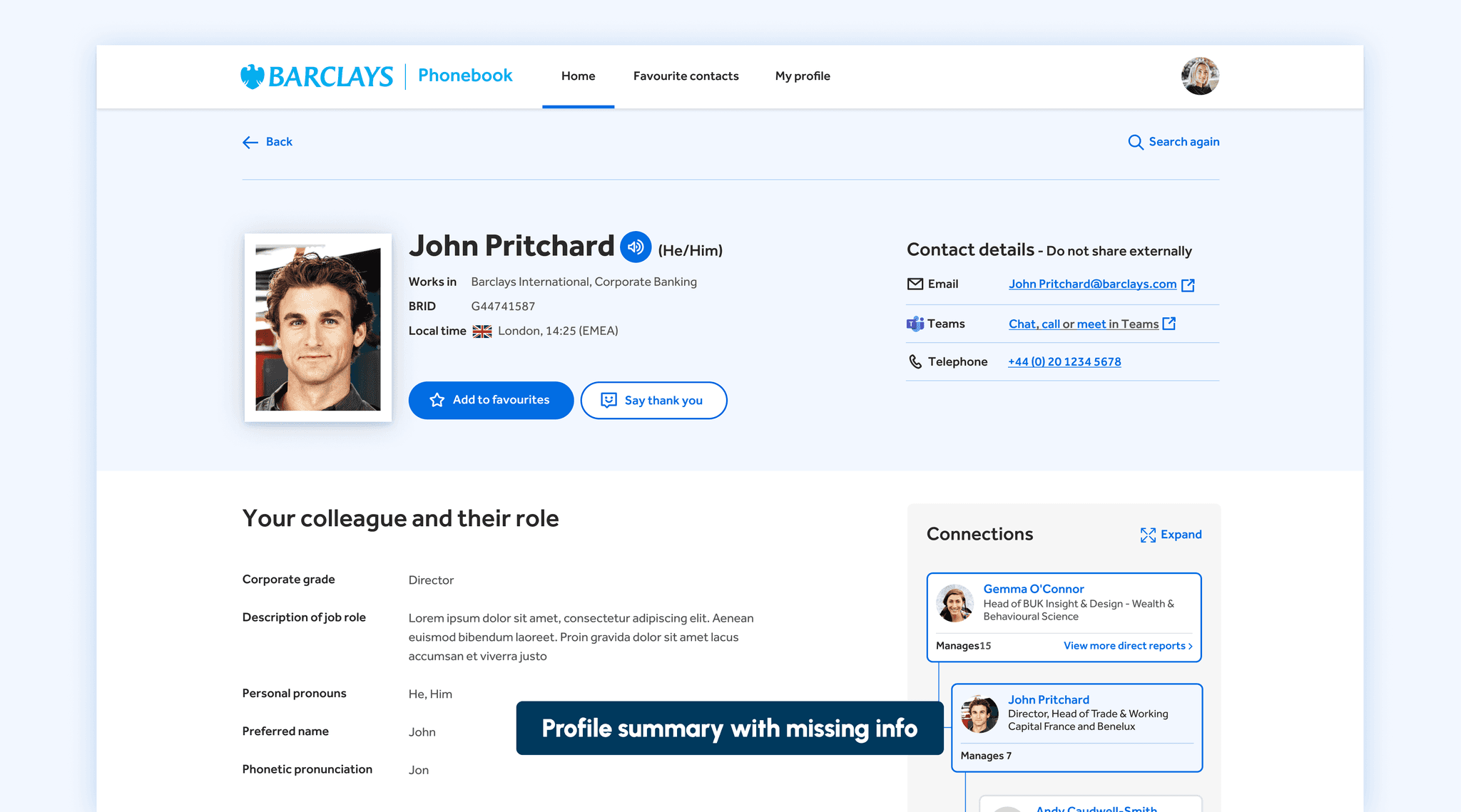
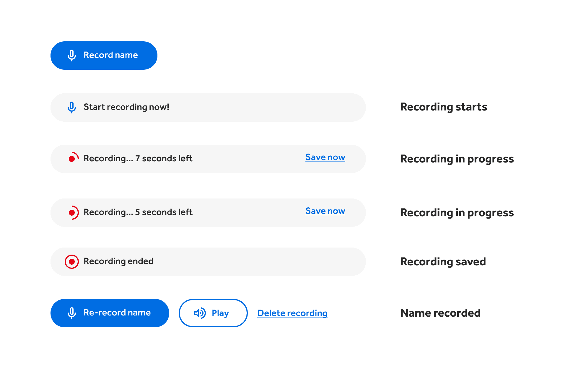
Giving the colleague profile a voice
Colleagues can record themselves saying their own name. This allows others to listen to how to pronounce a name potentially before having meetings with that person avoiding any possible awkward situations.
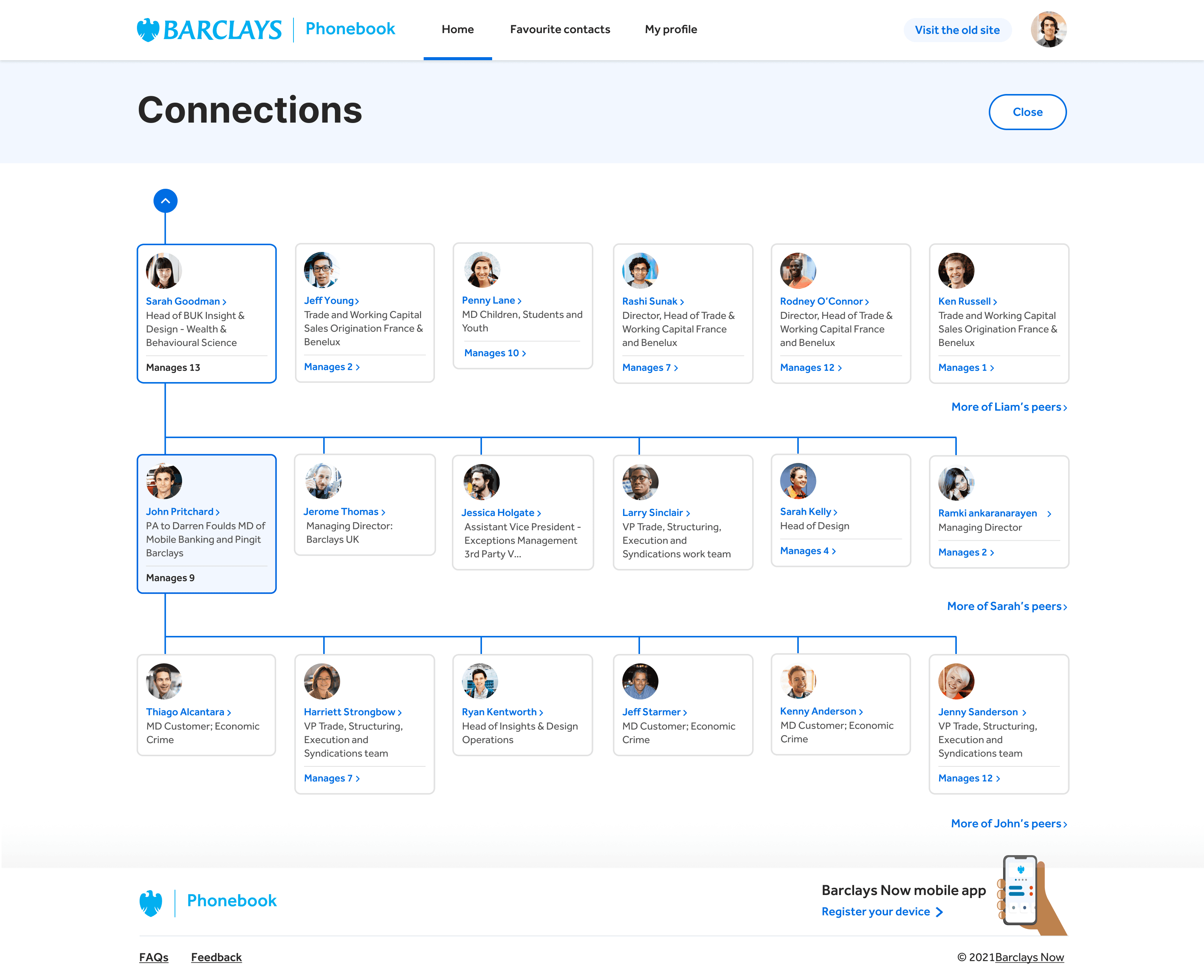
Navigating the Barclays hierachy
The new profile has an improved organisational tree initially giving a more focused view but can be expanded to a full page overlay showing more heirachy levels that you can navigate up and down. Originally the expanded view was designed to be shown vertically but due to feedback I changed the layout to a horizontal approach as this was easier to understand, navigate, and show more levels. We also worked closely with our internal accessibility team to make sure that connections was easily navigated using a keyboard and screenreader
The profile featured an advanced edit view with several forms that allowed colleagues to manage their profile details and out-of-office alerts. The profile was divided into different sections, and colleagues could edit each section individually. It was important from a design point of view that the forms had clear grouping and spacing to ensure colleagues could easily identify the sections or sub-sections of the form they were filling in. I provided all the UI for these forms along with all error handling for each form.
Making the colleague profile more inclusive
The profile is where a lot of the improvements and features were added. One of our main goals was to make every colleagues profile more inclusive and to achieve this we designed a number of new features which would help colleagues to get to know each other better.
Phonetic name
Similar to recording your name, we also gave colleagues the option to type out how to pronounce their name.
Pronouns
Colleagues can add their own personal pronouns and display them on their profile for colleagues to see.
Accessibility needs
Colleagues can add a description of any accessibility needs they may have that they want their colleagues to know.
The new phonebook went live as a beta alongside the existing version of the app. We added a prominent feedback button so colleagues could provide us with any feedback they may have. We ended up with 3498 colleagues feeding back with % being positive feedback and we reviewed the submissions for any consistent feedback or new feature requests and worked agile to implement any fixes or new ideas.
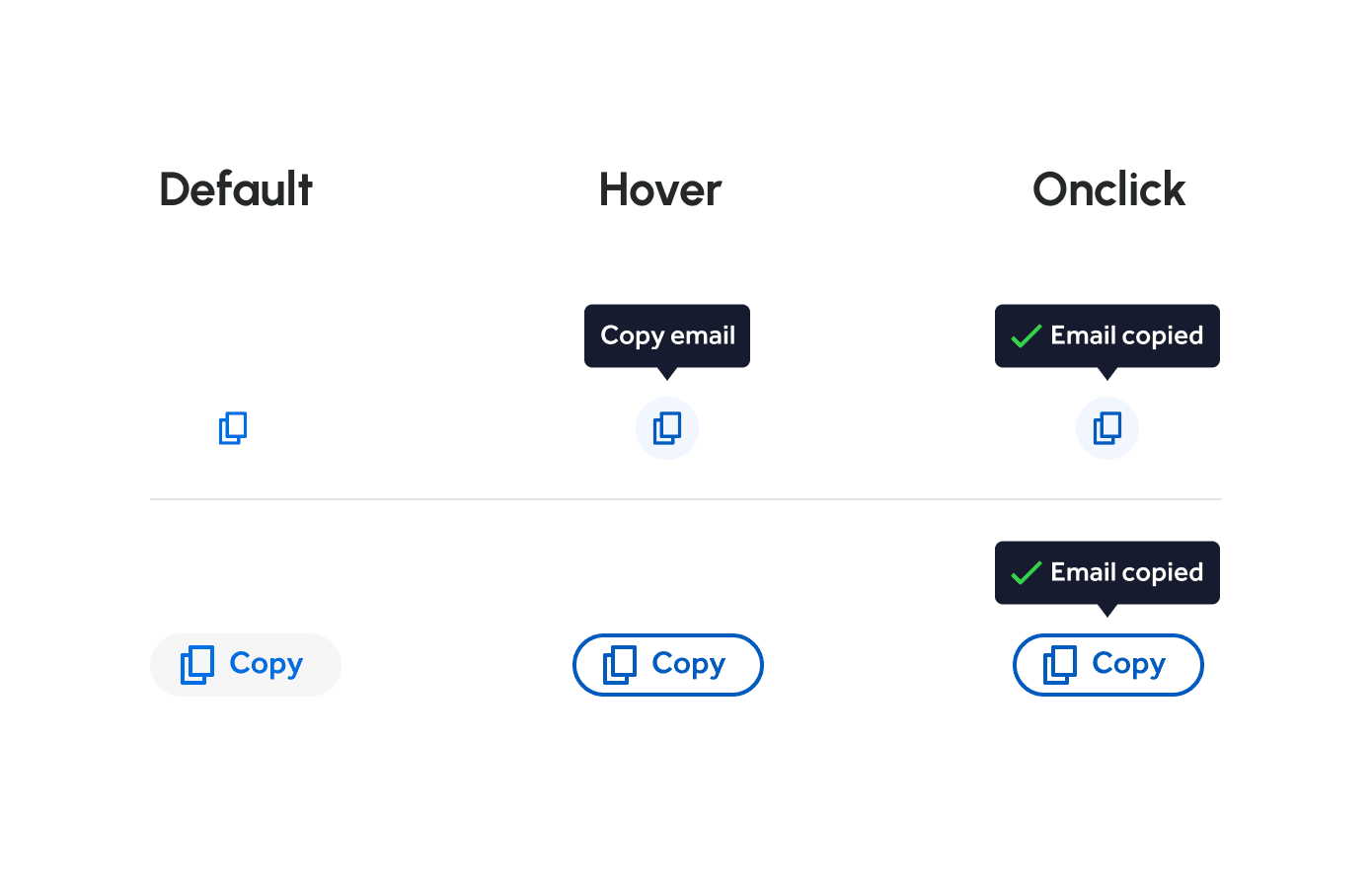
Ability to copy email addresses
One of the most asked for feature request we received was the ability to copy a colleagues email address at the click of a button. I designed up concepts and prototypes on how this could be achieved and presented these to stakeholders. The idea that got approval was simply introducing an icon wherever there was an email address shown and once clicked the email would be copied to their clipboard. This feature proved successful that colleagues want this feature added to further contact details.
Changing their profile picture
The current Phonebook used images taken by Security on the first day of their employment. Many of these photos were unflattering, taken in harsh lighting, or outdated. Following discussions with Security, we were given permission to potentially use a colleague's photo from MS Teams. I was responsible for designing the user experience and user interface for enabling colleagues to pull this MS Teams image through to the Phonebook.
Improving the search bar
nitially, we designed all the templates to allow searching, but on some templates, it was hidden behind a button. We received feedback that colleagues weren't seeing this button, or if they did, they were confused why the search bar wasn't visible by default. In response, I designed a new tool bar that incorporated the back button along with a search bar, and I also expanded the functionality of the search to show predictive results whilst the colleague was typing.
The new Phonebook app has been featured on the external facing Barclays.co.uk website